Sunday, September 29, 2013

Absence makes the heart grow fonder...

...or gives it room to wander! 
I haven't posted since last Tuesday as I was tending to a personal loss in the family.   They say that with great loss comes great gain.  My gain it realizing what is important to me and what brings me joy in my darkest hour.  In the end family and friends are paramount and will always be.   Although this blog will probably not be the legacy I leave when I check out of this world it does bring me joy posting my thought and analysis of the markets.     Having said that let us look at what the markets have done in my absence of talking about it.

In my last post I spoke about the 1687 area highlighting the large amount of volume that was transacted there thus far.    Below is the 30 min SPX PnF chart again highlighting that area.  This was a distribution area back in August and a supply area the large players avoided back on September 16 by gaping price above this level to keep sellers at bay eventually running the market to new highs.   Below is an excerpt from my September 17 post which I believe sums up the road-map I laid out.
Here is some food for thought, what if you were one of the many bag holders that bought in the 1684-92 area that just saw their investment recover from a nasty loss now turning a profit? How do you feel?  What if that market continues higher to challenge or even break to new highs roping others to initiate new long positions or add to their existing positions in the process?  How hopefully are you now?  Then the unthinkable happens, prices come back to your break-even price. What do you do?  Think about it. 

Clearly I spoke to Ms Cleo ahead of writing that post! 

Thanks for reading.


Tuesday, September 24, 2013

Gambling

You got to know when to hold 'em, know when to fold 'em,
Know when to walk away and know when to run.
The Gambler - Kenny Rogers
Did you know that Kenny Rogers recorded 59 records in his illustrious career yet this is the only one I know.  Shame on me.  If all his lyrics related to trading like the The Gambler does he could write a book on trading (instead of children's books...yes he writes children's books).

The market attracts all sorts of participants all using different strategies all with the same goal.  To make money.   Although I really don't care what methods people use or follow to participate in the market what is important is to determine the intentions of the masses.  The only way I've found to clue in on their intentions is by looking at what has happened using price and volume.

The 60min PnF chart of the SPX below highlights the amount of volume at the all important 1684 level we have been writing about for weeks. It has the highest amount of volume for the area between 1684.8 to 1689.09 (the box size is 4.32).   We also made the determination that this was a large supply area because of the distribution that occurred at these levels back in early August.  Subsequently the market gapped above these levels last week prior to the FOMC meeting. 


If we hone in on this chart using the 30 min PnF chart we can now see that 1687 area has the largest volume.  This is important because it tells us were the battle of demand and supply will take place.


So what about their intentions.  I will admit that determine the markets intentions is very very subjective but it the bias you need to enter the trade.  I previously wrote about the gap above the supply area of 1684 which I believe was intentionally done to keep the huge amount of supply at this level at bay so that the market could continue to rally after the FOMC meeting announcement regarding QE giving the large institutional players a chance to distribute their holdings at all time highs.  The volume on that day was the largest since the June sell off (which was accurately predicted as accumulation).   If distribution is what is happening then a break of that 1684 area may trigger an increase of supply into the markets without the support of the large players that just sold their positions.  That would trigger a hard and fast sell off just by looking at the amount of volume (supply) at that level.

Lets see how it plays out.

Thanks for reading.


Sunday, September 22, 2013

Point and Figure and Beyond

I'm pretty excited to have found out that volume by price is available on PnF charts.  This brings my PnF chart reading abilities to a whole new level.  Not only can I see where support and resistance is but now I can see the volume associated with that area of support and resistance all in one chart. 

In my last post we highlighted the levels of 1728, 1724, and 1705 using a 10 min PnF chart of the SPX.  Below is the an updated 10min PnF chart of the SPX including the volume profile at reach price range.  You will notice how volume is higher at these levels of support and resistance as one would expect since it is at these key inflection points that the battle of supply and demand takes place.    We highlighted the air pocket or lack of volume between 1705 and 1718 that this chart clearly shows.  What that tells me is that there is very little support (or resistance) at these levels.  Therefore, Fridays selling cut through this area with ease.  We can see that support (and volume) start to appear at the 1703.5 area so it shouldn't be a surprise if price finds support there.   

Friday's close was bearish as we closed near the lows of the day for the second straight day one relatively high volume indicating a possible distribution.  The key area I'm looking at is 1684 as this was a key distribution area back in early August as well as for reason highlight in my previous post you can read here.

So lets wait and watch. 

Thanks for reading. 


Thursday, September 19, 2013

Question: Where do we go from here?

Answer:  Nobody knows!

I find it interesting when the markets make new all-time highs how people do one of two things: they get busy with calling a market top or they make some type of prediction of how high the market will go before it reaches a top.  Both I believe are equally stupid.  If the markets are in uncharted territories hows does one gauge demand or better yet that demand will cease to exist at a predefined level that hasn't transacted a single trade?  We have what I lovingly call the Ms Cleo syndrome. I believe that the plethora of top calls come from the fact that with new highs being hit daily several widely used technical indicators are screaming the market is 'overbought'.  I never understood how an indicator indicated that markets are over bought.  Is that not the decision of the market participants to decide when the market is overbought?  If the current market levels are widely viewed to be overvalued then wouldn't the intelligent market participant sell their positions resulting in a market decline.  If so, then only after the decline has began in earnest would you be able to call a market top. Otherwise you are simply guessing.  If the market is moving up then I can only conclude that demand is still present not overbought (whatever that means).  Make sense?  Technical indicators are not overbought.  Unfortunately, they are overused and worse yet misunderstood which makes them dangerous.

The market provides us with clues everyday of the intention of masses.  So when the market begins to trade in these uncharted water we must take it day by day and see what story is evolving.  In my previous post I explained that I believed the intention of the masses was to rally the market and the tactic they used to keep emergence of supply at bay temporarily.  We hinted at the market challenging the all time highs since after gapping above the supply area of 1692 there was no supply above to really stop the markets from bursting higher.  All it needed was some good news.  FOMC to the rescue!

If there is to be a market top then we should look for signs of distribution.  First lets look at where intraday support and resistance are for the past couple sessions.

Below is a 10min SPX PnF highlight the support and resistance level (remember this is a 10min chart but we have to start somewhere).   There was a double top at 1728.6 and breakout and now breakdown between 1724.6 and 1723.2 (let us split the difference and call it 1724) and a breakout at 1705.8.   Simple enough.


Now lets see what type of volume has been transacted at these levels to get a better picture of supply and demand.   You will see the relatively large amount of volume at the 1705 level.  Interesting is the volume air pocket (I just made that up) between 1705 and 1718.  Also interesting is the breakdown of 1724 and now what looks to be test of that broken support.  A break below today's low at 1720 should result in a quick move back to 1705.  Lets see how this plays out. 

Thanks for reading.


Tuesday, September 17, 2013

The importance of history

“Disregard for the past will never do us any good. Without it we cannot know truly who we are.”
― Syd Moore
In trading, analyzing what happened in past and what is transpiring in the present is a requirement to anticipating the future.   You can quote me on that!  So lets first look at the past.  Below is the 30min PnF chart of the SPX from the close of August 30th.  You can see from the highlighted region that this trading range resulted in a quick drop from 1700 area to the 1630 in just a few weeks.  That trading range was an area of distribution.  What is distribution.  Distribution, as I see it, is the transfer of ownership from the strong to weak handed. How did we know this area was distribution? Because price moved lower after breaking the trading range! Duh!

Markets have a memory because the market is made up of many many greedy and fearful and intelligent and semi-intelligent individuals called traders and/or investors that have a memory. Some memories are pleasant some or nightmares.  Those individuals that went long within this trading range (or even worse higher) have a not so pleasant memory of what transpired after.


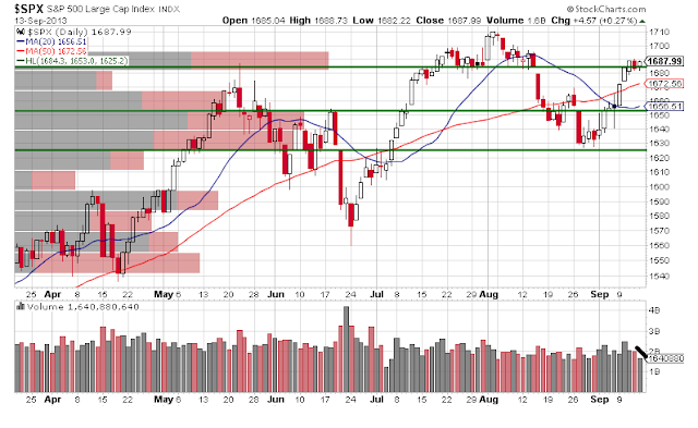
If we continue with our history lesson you will notice the amount of volume transacted within the area of 1684 and 1692 range was relatively large as indicated by the volume by price bars on the SPX candlestick chart below. Since resistance is defined as any area where supply exceeds demand the larger the volume at that area of resistance the more overhead supply.  The point is that we know ahead of time where the area of resistance is and the amount of overhead supply. Great information to have if price were to approach this area again. But that was history lets fast forward to the present.

Well price did make its way back to this area of resistance. What is so fascinating (and truly is fascinating) is how the market was 'speaking' to us as it traded at this resistance level.  You can see from the red circle on the SPX 60 min chart below that price consolidated in this heavy area of overhead supply between 1684 and 1692 for a couple of days BUT price didn't fall.  There was a lack of supply that entered the market in an area of heavy supply.  There was a reluctance to sell at these levels. Possibly because losing positions are now breaking even and the expectation is for further higher prices.  However, if the large institutional and professional traders want to see higher prices they are certainly not going to try to buy their way through all that supply should it begin to flood the market. They also know that the longer price remains at these levels without any upward progress the more inclined those holding at break-even are to sell.  Don't want to be twice bitten! So when you see a large train of supply potentially coming your way what do you do? Jump over it like an Olympic higher jumper.  That is exactly what happened.  You will notice that Monday's opening gap began at 1691.70 (lets round to 1692), the top range of the overhead supply, and prices never looked back.  Brilliant! The bag holders in the area of 1684-92 are finally seeing a profit and are patting themselves on the back for holding instead of selling with their sights now set on new highs.  The large institutional and professional traders where able to leap frog over the overhead supply with minimal cost and increase their profits.   Of course this is just my interpretation of what I think is happening but if I'm even partially right then remembering what transpired at this area of resistance will help us the next time price revisits this area.  

Here is some food for thought, what if you were one of the many bag holders that bought in the 1684-92 area that just saw their investment recover from a nasty loss now turning a profit? How do you feel?  What if that market continues higher to challenge or even break to new highs roping others to initiate new long positions or add to their existing positions in the process?  How hopefully are you now?  Then the unthinkable happens, prices come back to your break-even price. What do you do?  Think about it. 

Thanks for reading. 


Sunday, September 15, 2013

The Devil is in the Details

Did you know that the original phrase was 'God is in the detail'?  It just doesn't sound as catchy.  Today we are going to look at the details at the lower time frames as those details tend to manifest themselves in the higher time frames.  I like to look at the both the daily and intraday time frames as price approaches our key levels of support and resistance to try to understand what price and volume is 'hiding' in the lower time frames. You will also notice the principles are all the same no matter what the time frame is.

First lets look at the SPX daily chart and we can see that since we hit the 1684.3 resistance area that price hasn't really progressed either way.  However, volume has been declining and the price range for the past couple of bars has shrunk considerable.  That is what I would call consolidation.  But the question remains is it consolidating in a bullish manner (accumulation) or in a bearing manner (distribution). The fact is that the large professional traders are not just chillin' out deciding to take it easy for the past couple of days.  They are either interested in moving prices higher or getting out and allowing prices to drop.  As the title suggests lets see what devil we can find in the details.
Below is the 15min chart of the SPX for the past 3 trading sessions.  I've highlighted the break out bar which is the bar that broke above our 1684.3 resistance area on increased volume (funny how does that).  That is our first clue in our chart sleuthing.  The second is the various tests that occurred at the same level of our break out bar.  Three times (as in the Holy Trinity) price dropped to this level only to recover.  You will notice that price closed near the top end of its trading range on each of those test bars.  That would signal that demand was present and that my friends is bullish.  We have to remember that the current price area we are in is also the break down area we saw back in early August which we identified as distribution so there are a lot of bag holders that may be itching to get out. However, the bulls are making a grand effort to push above this overhead supply and a jump above 1690 (Thursday's high) would be very bullish for a continued move higher. It might give the bag holders more incentive to hold on to those breakeven positions for a possible profit!  Wouldn't that be just dandy?  Of course a close below our break out level (1684.3) on increased volume would favor a bearish move.  Now that we completed our exorcism of the markets lets watch what happens in the days to come as price rarely stays around these key levels for too long before a decent move occurs. 

Thanks for reading. 


Tuesday, September 10, 2013

Resistance

We highlighted the 1684.3 area of resistance and voilà a high of 1684.09 with a close of 1683.99.  I know it seems like magic and the pin point accuracy sometimes even amazes me but its not magic its just good ole price and volume analysis.  You really don't need to understand any more than this but a deep understand is still required.   People think they understand the relationship between price and volume but they treat it like an indicator instead of the basic building blocks of the market and the tenets of supply and demand which is essential how the market operates. 

So now that we are at resistance what now?  Do we sell? Lets look at what the chart is telling us. Again lets look at the 6 month daily SPX chart below which highlights both the large amount of aggregate volume at the current area of resistance (1684.3) and today's increase in volume with price closing essentially at the highs for the day.   The current price level interesting enough is where we broke down after a period of distribution back in early August that we wrote about here.  By identifying this as a previous area of distribution we know that at these levels large players unloaded their shares to the retailers (I think this is called holding the bag) only for the retailers to see a 50-60 point drop in the market. Now imagine if you are holding a losing position that is coming back to break even after a month of holding it (because you didn't have stop loss and decided to rely on hope as your trading strategy).  What would you do or should I say the typical retail investor do?  That's right they will sell into it and that is why we have the overhead resistance.  That is also why we need an increase in volume to overcome that potential influx of supply at resistance in order to break through this level.  We did take our first steps into breaking that resistance today with the increase in volume and the close at the highs indicating demand is present but the bulls are far from claiming victory at this level.  The test will come tomorrow and/or the day after. 


If we zoom in on the 30 min SPX chart will get an even better picture of where the battle of supply and demand is and as one would expect its at the current resistance area of 1684.3.  It does however, look like an intraday double top is forming as prices hit resistance pulled back and rallied back to resistance at the close.  If you were long then tomorrow is going to be a critical day to decide to stay or go.  If you are looking to initiate a short at this level then you will be looking for signs that supply is enter the market.  I'm leaning towards the latter. 

Thanks for reading. 


Monday, September 9, 2013

From Support to Resistance

Elementary my dear Watson! 
The observations made in yesterday's post  that the recent price action was viewed as bullish with prices possibly exceeding the 20dma and 50dma resistance areas came to fruition today as the markets rallied to close near the highs of the session.   Let me explain why I thought it would not only rally but exceed the 50dma resistance area.  I've regurgitated the intraday 15 min SPX chart from yesterdays post to highlight the accumulation that was happening at our pre-defined level of support at 1653.  The volume by price (~3pts to a bar) on the left side showed the large amount of volume transacted at the 1653 area indicating that the professionals were active.   You will also note the amount of volume transacted at the highs between 1662.5 to 1665 was quite low.  This was the key to my prediction of a break of the highs. The 1665 area was the 50dma where prices backed off yesterday.  However, the low volume transacted at that level before prices pulled back into the close indicated the lack of supply coming into the market at those levels.  In a sense the market 'showed us its hand' through volume.  Therefore, giving all the buying that was going on at the 1653 it won't have taken much to overcome the overhead supply.  That is exactly what happened today right from the opening prices jumped higher to challenge the 50dma absorbing the remaining supply and continuing higher from there.


If we look at today's 6 month daily SPX chart you will notice that we are entering a price range of low volume.  Once again it will not take very much demand to continue higher and overcome and overhead supply.  Interesting enough the next level of resistance is the 1684.3 where coincidentally the amount of volume transacted in that area is relatively high.  I have to admit the volume by price or Volume Profile displays the price volume relationship in such a way making it very easy to pin point where the battle of supply and demand will happen.  Fun times ahead!

Thanks for reading.


Sunday, September 8, 2013

Support or Resistance

You know my methods, Watson. Sherlock Holmes
I've always wondered how well Sherlock Holmes would have traded the markets.  The master of logical thinking along with his uncanny ability solving the most impossible of cases would surely have mastered the markets.  I think so.  I believe that logic can solve this market which appears otherwise so random.  I don't believe that the markets are random because I don't believe human emotion is random just like a don't believe the human composition of atoms and molecules is random.   Order can be found.  

Okay enough of my philosophical ramblings.  The behavior of the market this week was actually quite interesting as we bounced off of support back to resistance at 1653.  The interesting part was how price closed right at resistance at 1653 on the Sept 4th on high volume.  The next day (Sept 5th) we see price advance to the 20dma before backing off and closing above 1653.  The low for that day was 1653.  Interesting.   Friday's (Sept 6th) action was driven by the job's report so we see how people reacted to those numbers with a large price range with price hitting the 50dma then closing slightly below the 20dma.  I have basically stated the obvious but still the question remains is the recent action bullish or bearish?


To answer that question I like to look at the 15 min intraday SPX candlestick chart plotting the 1653 price level and look at what both price and volume is doing at this key inflection point.  The first thing to note is that volume at the 1653 was quite large in comparison which isn't surprising since it is at the inflection points where the battle of supply and demand happens.  There is also a transfer of ownership that typically happens at these levels.  So just like Sherlock would have done we look at the facts and come to a conclusion.  The fact is that price on the daily bars are bullish since we are closing near the top of the price ranges and volume is increasing at the 1653 level which I'm viewing as bullish since on Friday the bears had a chance to take the  market down but recovered indicating demand was present.  However, I am fully aware of the 20dma and 50dma currently acting as resistance.  I'm going out on a limb believing that we might just break those levels in the days to come.  Let see what happens. 

Thanks for reading. 

Friday, September 6, 2013

Volume Profile

Looks like that the double bottom we highlighted on the SPX chart in our last post materialized. What is more interesting is how we rallied right back to resistance on very low volume (the SPY volume was even lower).  We also hit the 20dma before backing off today so we are clearly in an area of resistance.  Once again to break resistance we need to see demand overcome supply and for that we need volume.   That is exactly what we did NOT get. 

I'm excited that I have found the Volume Profile indicator and more so that it fits in nicely with all the mumbo jumbo that I've been rambling about when it comes to the battle of supply and demand. The Volume Profile  represents trading activity over a time period at specified price levels.  The Volume Profile can be used to determine the strength of the demand and supply at the pre-defined levels of support and resistance.  Sounds brilliant doesn't it!? I think so. 

Thanks for reading.


Monday, September 2, 2013

What I've learned

So far my journey to master the Market Profile has lead me to download a book on the subject and sit through a few free online videos on the subject.  As with anything understanding how and what the Market Profile is measuring is paramount.  You won't believe how many people use an array of technical indicators without having the slightly clue how and what they are measuring.  They simply follow the "rules" of trading the technical indicators such as go long when the squiggly line moves up through the 20 level or sell when it moves down through the 80 level.  If making profits using these simple approaches could be so easy won't we all be rolling in it.  Sigh!

To continue the Market Profile provides a statistical analysis of time and price, typically in 30 min intervals to create a graphical representation of a trading session.  The cool part about the Market Profile is that it will show you the amount of activity at each price level.  It will display the amount of volume traded at each price level as well as how often it traded at those price levels.  I won't get into the deeper discussions as to how to interpret this information because I would rather come up with own conclusions and ways of analyzing it versus regurgitating someones else's thoughts.   However, it appears to complement the theory of supply and demand and provides a closer picture of that battle on an intraday basis.  So the learning journey continues. 

As for the markets, the 30min PnF chart of the SPX highlights the areas of support and resistance.  You will notice that 1630.9 was support and once broken lead to a significant move lower.  The same can be said for the 1624 area only it was resistance and once it broke moved significantly higher.  Therefore, since support and resistance is both an art and science we can conclude that the area between 1624 to 1630 is currently the support area.  


The interesting part of the 30min SPX candlestick chart is the amount of volume transacted (left side bars) within the support area defined above (1624-1630).  The battle of supply and demand happens at these key inflection points and its clear that the professional money has been active at these levels.  Are they accumulating or distributing?  Sort of looks like a double (one could argue triple) bottom doesn't it? Lets watch and see. 

Thanks for reading.